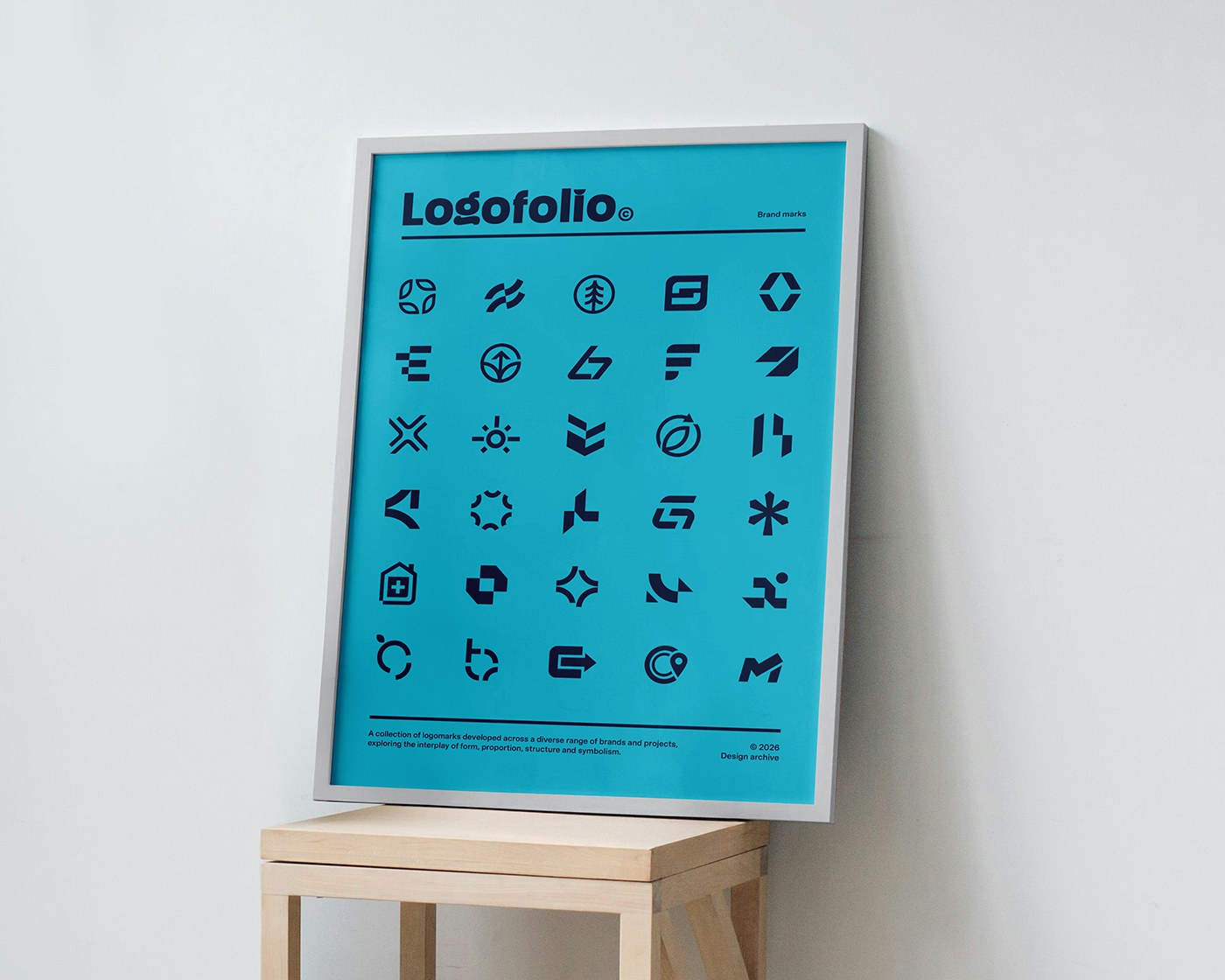
Welcome to volume one of our logofolio.
A collection of logomarks developed across a diverse range of brands and projects, exploring the interplay of form, proportion, structure and symbolism.

Working across a broad range of briefs, from established organisations evolving their identity to start-ups establishing a distinctive visual presence, each project brings its own challenges and considerations.
Our process is grounded in understanding the brief, identifying the core idea and exploring how this can be translated into a clear, distinctive and purposeful mark.

We created a poster to celebrate the logomarks we’ve created over the years, bringing together a selection of marks that reflect the ideas, forms and approaches explored across our work.

From refined geometric forms and considered simplicity to more individual visual concepts, each mark is shaped by the character, purpose and context of the brand - creating identities that are as relevant in application as they are in isolation.
We design logos with longevity in mind, creating forms that can remain relevant as a brand evolves. Rather than following short-lived trends, our work focuses on clarity, balance and enduring visual principles, resulting in identities designed to work across changing applications, platforms and generations of a brand.
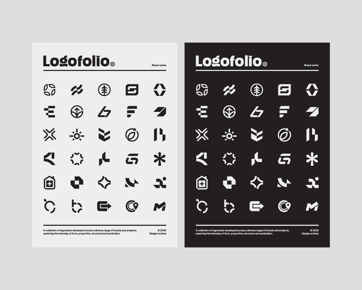
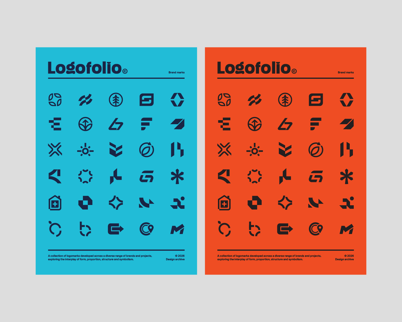
These marks reflect a collection of varied briefs, sectors and creative challenges - and the processes, ideas and visual exploration that have shaped our work over the years.
Years of ideas, exploration and design - distilled into a collection of considered marks.